Wednesday, 21 March 2012

Evaluation


 Whilst designing my product I decided that I needed to follow and challenge current media conventions to mantain a professional standard across the texts. Because of this before I even began to design my Poster and Magazine I researched a huge amount of information and designed a multitude of moodboards to take inspiration from. The first big development I noticed was the themed Empire magazine with big releases. I wanted to recreate a similar effect with my final product as I loved the look of various design schemes to an ongoing masthead. I aimed to challenge and recreate this effect, but I noticed something important that nobody had done that I tried to create in my masthead on my poster. I moved and altered the angle of the Empire magazine logo to provoke a new style of themed mastheads as it went well with my Art Deco" themed Image. I wanted this to give an artsy vibe as I personally would say my film is quite artistic and interpretative. All in all I have loved trying to work with and expand upon industry standards but at the same time mantain a professional looking text all the way from my initial film poster to my final Short film.

The problem that I struggled with, with media conventions, was the extremely strict rules on certain parts of a magazine or a film. I struggled at getting the formula right between creativity and professionalism. This was hard for me as I wanted my magazine and film to look unique and challenge the previous media conventions but at the same time I didnt want the final text to look poor quality without any rules and standards of professionalism. I decided the best method of understanding certain media conventions was by creating a mood borad out of various other articles to notice an ongoing theme. I think I was sucessful overall at sticking to media conventions but unfortunately in some areas such as the films production I found this extremely hard to cope with such as smooth transitions from shot to shot.


Media has become an essential part of the way we live. This can range from reading the news on your laptop, blogging about it, creating vlog's about it or even designing a petition for it. This revolves more around the idea of WeMedia. My use of media technologies was essential in the production of my media work. My most used technology had to be a combination of Adobe PhotoShop and Internet Tutorial video's. I used this to my advantage as it allowed me to improve on my initial photoshop skills. For example by the time I had finished I realised I could add a neon glow in various colours by using outwards glow, the colour filter, colours and adding a gaussian blur. This small technique allowed me to design the Empire masthead in the "What Has Been Learnt" section. I decided to use blogger to display all of my media work as I thought it was fitting and relevant within the modern media and some of the case studies we had researched. I also like the way it was easily avaliable because it could be acessed from any browser, this meant that my media could be acessed from any computer. I also liked the way I could add images, video's and interactive elements. I think I have utilised this modern technology by adding video clips of progress and enabling me to extend my knowledge on certain programs such as Sony Vegas and Adobe Photoshop. I had to look at multiple tutorials on the web on how to fade and create neon glows and create shattering effects on texts which I think turned out sucessful and professional in my final production. Another big step in media technology was the way I wanted the audience to view my work. I wanted it to be able to be acessed on mobiles and portable devices such as tablets so that my blog, video and images were acessible no matter what medium of entertainment was used.

After researching the history of short films I have discovered that actual editing of films has become a much easier practice thanks to the range of digital programs that allow you to easily drag and drop clips togethor to produce a final piece. I personally found it easier than my colleagues as I decided to use my flip HD for recording my film to both increase the quality of the clips and reduce the amount of time dedicated to editing by the hardware automatically cutting video clips. This made editing easy for me as I was only required to: Crop, Add Filters, Add Transitions and Add sounds to the short film. When I began to edit my film I noticed that one of the most important techniques was the way that music fades in and out to create atmosphere. I think this was most crucial to my film as I was allowed to edit the music digitally by using Audacity. This enabled me to spike volume to make people jump and add tension to much more subtle and slow scenes. This took some getting used to as I found the controls hard to handle at first but quite quickly picked up the basics


In the 2 years of experience I have had in media I have improved a great deal and in the process I have learnt a host of new technical skills. I learn basic things that could vastly improve my video, sound and image editing. I decided to stick to my original editing packages as I personally have no faith in Serif products in comparison to Sony and adobe. I started by designing my film in Serif but became quickly aware of its flaws and technical limitations. From this point I changed to Sony Vegas and although it began difficult to use, became second nature to edit cut and add media effects in real time to my film. The editing became much more complex by the end of my productions that ranged from being able to add gradient darkness in and out of scenes and creating audio spikes with the Sony Vegas sound editor. I found this a very interesting editing technique as I could add moments of tension by spiking the audio to make a loud bang. This was limited by how much the listener could comfortably enjoy, so I had to remain reasonably quiet as not to damage somebodies ear drums but still retain the horror side.
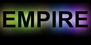


My other editing progressed mostly with Photoshop as I was already quite familiar with the program which allowed me to try experimental things like creating a shatter effect with my original magazine cover. This gave my empire a splintering effect with the use of paint brush and lasso tool. I referred to online tutorials to harness other effects that I added. One specific effect was the gradient colour effect. This allowed multiple colours to be produced from a simple word and allowed me to overlay them to create a great effect. I quite liked the way there was a neon impact and designed a test product to see if it would fit with my magazine cover which it unfortunately didn’t.
I progressed from using this neon glow technique to making my title have a shatter effect that I adapted from this technique (Found Here: http://www.digitalartsonline.co.uk/tutorials/?featureid=1753). I liked the aesthetics of the destructive shattering effect and put it in my own work in subtle sections. I also considered using a shatter text for my short film movie intro.

I also learnt a lot about media conventions and the way to make a specific audience intrigued by my work and other ways of making a text look professional by mimicking other industry standards such as taking a certain Masthead style from Empire magazine and sticking to a certain colour scheme of the magazine. This course has altered the way I think about certain media types and the way they are used to manipulate and entice the reader. This ranges from simple colours that connote certain feelings such as the main highlighted banner area behind the Q in the 'Q' magazine is there because the colour red connotes violence and warning and passion to grab the audiences attention.

Another important technique I learnt was the proxemics of a page and specifically the way magazines were arranged to lead your eye. This technique was most dominant in such film Posters as "No Country For Old Men" and "A Clockwork Orange". I noticed that as far as proxemics were concerned the only thing that changed in the film poster in the 36 years of time between posters was the text in the top left of the poster which was removed from the newer more streamline posters. I think this was one of the most important techniques because of the ability to split the page into thirds. As far as the aesthetics between the two, I noticed that mostly they have a similar style that I tried to stick to myself.


From taking media this year I have not only learnt a huge amount from taking lots of Photoshop, Sony Vegas 11 and Audacity tutorials but I have learnt most about digital media as a general medium to work from. I have created my own blog after participating in this course and have discovered a range of different ways to produce my creativity through a computer. I am also considering moving from using photoshop to moving onto 3D modelling software such as Autodesk: MAYA and 3DS max.


I created these questionnaires so that people could give me feedback about the posters in hopes that I can improve them so that they are more aesthetically pleasing to customers. This feedback may be added into the film page covers from the initial design into the finally produced version. It will also decide for me which front cover looks the best out of the three mocks. At first I became highly hostile towards any kind of constructive comments as the amount of time I had spent on my film made me very protective about certain remarks but after taking some audience feedback into account I noticed it made an improvement and made it clearer to the audience what was going on. At first I wanted to ask for feedback online but as this was only a premium service and the feedback could be biast I decided to ask random people to review my films so that they wouldnt have any emotional attatchment to myself so that they would answer honestly and bluntly. This was possibly my most useful feedback I had as some crucial plot points went over some viewers heads rendering them confused and the entire short film as a whole pointless. This comment resulted in me making the film very clear by adding a non diagetic voice over from the first person perspective.  

From the audience feedback there was a strong theme of criticism of the narrative in relation to the narrative. This may have been due to a slightly over-ambitious script and poor dialogue. Because of this I later considered working on a voiceover to describe the situation as my film wasnt clear enough in some area's. This said I decided to ask my actor to watch the film and tell me where and what he thought should be added as I edited with him side by side so that I had a seperate from of criticism to try and make my film as good as possible. My film was heavily influenced by criticism and audience feedback as I wanted the public to enjoy my film. I was quite picky with my audience as I wanted a more mature audience to view this film as it had a morality message and at the same time revolved around a complex selection of themes. I wanted it to challenege the audience rather than just allow them to watch a film. I wanted it to have its own form of interpretation that was reflective of the films I had styled mine on (A Clockowrk Orange, One Flew Over the Cuckoo's Nest and 2001 a Space Odyssey) 

Wednesday, 22 June 2011

Preliminary

Planning


Before we shot our short film our big problem was deciding on what we were going to shoot it about and how the very linear story we had to follow with camera maps and etc could be tweaked to make our film more original than others.
 After a brief discussion we came to a decision of making a crime thriller as it would suit our surroundings best. Once we had done this we ran into two problems: The first being, we would have to try and wear similar over the two days of shooting and we would also have to get past a security lock door without involving any of the cast to open them. We sorted the first problem extremely well as we shot the whole thing in one day of two and for the second problem we learnt we could quickly unlock the door and then instantly open it when the cameras were rolling.


Evaluation


What was the task?


Our task was to shoot a preliminary video of somebody walking down a corridor from multiple angles to make it intriguing and for them to proceed to opening a door with an extreme close up so that we were introduced to continuity editing. We then had to film us both saying dialogue from over the shoulder shots which both enforced our knowledge of continuity editing and the 180̊ rule. This dialogue could be whatever we wanted so we decided to do crime thriller.


How did you film it?


We decided to film it very close and personal to try and translate the aggression felt by the character to the screen. It also helped that we had 4 members in our group so that the jobs could be distributed so that there was two camera men allowing us to film much faster and have higher quality shots. We also tried to maintain a very unique and aggressive flow of the cameras to enforce Jordan's masculinity. We wanted it to be always shot from a low angle shot to emphasis his dominance.


How did you put it on the system?


We transferred it to the system using adobe premiere. I wasn’t particularly impressed by the schools selection of cameras as they were all using tape instead of a modern method of using memory cards. This presented me with the first problem that involved using old technology: We had to find a method to upload the footage onto a computer. This lead me to the first solution of recording it with Adobe Premiere suite with the USB cable. I was surprised this worked as I didn’t think it would be compatible as the cameras were from the middle 90’s


How did you edit it?


I edited it using Adobe Premiere. This was extremely easy to use as I already had a decent editing base knowledge from using Sony Vegas previously. This made the cutting and transitions much easier to handle but took a slight bit of time adapting to the program. This wasn’t too much of a problem but I still found it difficult to edit things to an Nth degree as the editing bar wasn’t able to handle small imperfections in the video.


What sound did you add?


We added an ongoing soundtrack that played constantly underneath with very low volume to create a very tense atmosphere to reflect upon Jordan’s looks and persona. I wanted this to fade in from the start of the film and change only once at the end of the scene when the credits rolled. I did this to create an interesting undertone underneath the tense interview scenes portrayed.
 It took quite a while to choose the sound and after making the short film I realised that when I was going to do the final version I would have to try and either record my own music which would take quite some time of composing and playing or I would have to find a piece of music to complement and enhance the piece just so that certain points of the song would reflect a climactic scene rather than having a poor judgement of various moments.
 Once we had found the track we realised it would take quite a while to also edit it as I would not only have to shorten moments of the soundtrack to reflect the scene but I would also have to try and make this then follow on in synchronisation to the next clip of it so that it perfectly looped.


What did it achieve?


I hope it achieve a very tense crime thriller that had a very cinematic feel through the use of continuity editing and non-diagetic audio. This was my plan to keep it very subtle to emphasise the tension. If I didn’t make it very subtle I think the scene would have seemed almost comical, which was the polar opposite of what I wanted.
It also taught me quite a few things when making a film. First of all I now realised that I would constantly have to have the exact same mise en scene in every shot and how the subdued music in the background emphasised a lot of the scenes and created hugely dramatic and atmospheric scenes. I also caught myself 'barrelling the camera' by complete accident which I would have to avoid in the real thing as this both looks extremely unprofessional and adds comedic effect without realising you have done it.

Research

BALANCE
This is my powerpoint with the initial idea of my short film, it was aimed to make the user think about a decision and the reaction to this decision and how it might affect others. I wanted it to have a similar style to the short film "Black Button" (http://www.youtube.com/watch?v=QrKnhOJ-R80) as I loved the final twist of it. I also enjoyed the simplicity of how it was shot and how the actors managed to keep your attention through the lack of knowledge of the action until the closing seconds for a fantastic twist.

Here is my Presentation in powerpoint form and you are able to download it below or view it individually when you click on the image


This was the first Short Film I reviewed as I thought the attatchment with the character was the same as the effect I was trying for in my own and after spending some time deconstructing the film shot by shpot for the first few clips so that I knew exactly what was creating sympathy towards the character and how I could replicate this same effect in my own work.

History Of Short Films
I found this section quite interesting as Short Films have had quite a rocky history as the majority of the time they have been referred to as the poor man's feature length despite (in my opinion) it taking much more skill and creativeness to condense a 90 minute story and managed to keep the same feeling of originality, character development and crucially a hook that can keep a viewer entertained.


Target Audience

Target Audience


The short film industry’s audience is quite specific compared that of the mainstream audience of larger full length films. There are two main groups of people who will be familiar with short films; unemployed students seeking a future in the film industry and people who are already successful in the industry. This meant that I had a short amount of time to impress the viewer. At first this seemed an advantage but at later time it seemed that this might be a negative point. I had to change the plot to fit this restriction as it lasted much longer than my alotted time. This meant that I had to condense a plot to still leave the viewer slightly confused and disorientated by a moral choice in a much smaller time than usual.


This also spurred me to think about my second problem. I needed to decide what genre I was aiming at, whether it was going to be a scary film or a thriller. I had looked at the films that closesly related to mine so I could have a base to try and place my film under. That way I didnt need to distinguish the genre so much and more towards finding the actual target audience. For example, one of the films I chose was "A clockwork orange" because it had a very specific target audience of a more artsy film audience with a hint of a thriller. I also liked the role it took for the main character being an antagonist but at the same time remained a relatably hostile and agressive character. I loved the represenetation from the film and in some ways the metaphorical nature of some of the characters and underlying themes. I tried to reflect this same effect in my short film through the use of confusion and sound effects. I wanted it to be very artsy.


Another inspiration would be the coen brothers on a directorial front as they have a constant noir feeling but at the same time, continue with the twisted and unclear plots that twist character depictions and challenge industry standard "pretty boy" actors and take on a much deeper and 3 dimensional view of films. Most of these films are based on an older male audience as the thriller genre is a male dominated genre.


The main problem I had with target audience was that I didnt know who to design my film for at first and that I wanted to innovate with my short film so at the same time I didnt have a specific genre at first. Once I got over this hurdle I realised that to pin my film under any specific genre it would have to be a thriller as it had a sense of horror but at the same time had a sense of action. I had to try and compare this to a certain film and because of this I decided to choose such films as "one flew over the cuckoo's nest", "funny games" and "No country for old men" as these all had a common morality feel at the end of them which I wanted my film to leave the viewer with.

Design Process

Today I have first started on the design element of our front covers properly, after the previous attempt of designing a magazine title a few days ago. I kept the magazine Masthead exactly how it was due to the simplicity yet effectiveness of the Masthead. The first thing I noticed about the simialarities between magazines was that they all had the Masthead slightly below the top with a Slogan. I also noticed that it trended that the image was displayed above the Masthead to impose a feeling of three dimensions, I wanted to replicate this design style on my own work. From this point I gradually created a flash at the top left image and re-arranged the page to make sure my central image would fit. I changed the masthead as it looked too simplistic and because of this I altered it with some lighting effects and put two lines through it to connote a feeling of opression to match the themes of insecurity and paranoia in my film. I personally thought it suited it better and decided to change it to this style format.


I moved on to my second project and aimed for a more Art Deco style to bring out the abstract from the film similar to the stylings of "A Clockwork Orange". I started with my Masthead, as this to me is the most important feature on a magazine cover and at the same time sets the colour scheme. With this I wanted a toned down Red, Monochrome style. From this point I realised that the Masthead looked too plain for my liking so I edited it so that it was on a slant and slightly off skew. This was it created an eye catching double Masthead with both the title of the magazine and the title of the Central Image. After this I designed the articles to fit with the same sort of style by designing them off skew and at the bottom design a banner that matched the same design scheme as usual Empire magazine. This design appealed to me the most at the time but because of my 3rd and final design idea I am swaying more towards the strip looking Masthead.


This was my final design and probably my most intuitive Masthead up to yet. I began to use the same Empire title by highlighting it with the magic wand tool but when it began to painting it a colour I decided that just colouring a straight colour was a mistake and when I began to paint it I loved the look of just painting some of it and leaving the other sections blank to create a shattered like shape and to follow the design theme of my film. I still replicated the same design as Empire itself so that it didnt look unprofessional at the same time. After a look at this Empire cover I noticed two problems, the first being the featured article looked quite small and plain. This problem was solved on my second version. I changed the article so that it was across the full page and much longer in width. Instantly that small tweak made it look much more exciting and professional.The biggest problem that I realised and had to add to all of my magazine articles was the coulour palette tester at the top left and right of the gutter so that I could identify if it was printing correctly. I also realised I had been missing out on a serial code on all of my covers which was at a 90 degree angle on all empire magazines so later I had to replicate this design element to make it look professional.


This was my first attempt at a movie Poster and possibly my favourite piece of work up to yet. I wanted to design it so that it had the simplicity of the trainspotting poster and at the same time retained its artsy style much like "A clockwork Oranges" infamous poster. This made it quite tricky as it had a mesh of two design styles but after some tweaking and an (at first) unprofessional looking poster with the title at the bottom of the page. I rectified this by replicating the same effect I used with my 2nd Balance magazine. This was to create a banner of a block contrasting colour and put it at the very top of the page. I did however change this design method slightly by making it at an exact horizontal angle. On top of this I used a colour splashed effect to the main image so that the scales popped from the image and created a contrasting effect. I wanted to use the colour red to match the same ongoing theme of "Sin-City" because I loved the way it looked. I liked the block look that the white line created, this made it look much more effective and less plain. I liked this effect with the image.

After I had finished my movie magazine I realised that my image suited the magazine cover better instead of the movie poster so I decided that I would use it on that and because of that change my inital movie poster Central image. For this I decided to take on of the images from the range of shots I took whilst filming and decided to stick with the theme of monchrome with a colour splash of red to connote a feeling of violence, panic, and anger so that the films themes would be visible from just the poster, I also decided to add a tagline like the bottom of "No country for old men". I decided to call it "Life and death, is only a decision away".


This was my final design of the front cover and the one that I think I can say I like the most is the red highlights on the scales, it adds an eyecatching effect to the rest of the magazine and makes the scales "pop" from the monotony of the sepia toned image. I quite liked this image as it reflected the feel of the short film I made. I like the art deco style of the words as it felt a lot more artsy than the usual masthead of an Empire magazine and I quite like the way it challeneged industry standards. I followed the industry development standards such as the printing colour palette at the top of the image along with the gutter margins on every side so it doesnt create problems with the printers when creating my magazine. I also included the bar code at the bottom left and remained with the same issue number and price at the top left. When I first edited my image


When I was designing my films logo I took a few design decisions into account. I made sure that the image was able to be used with a 3d Bump Map. This meant that I wanted to keep it a minimalistic black back ground with text in white. I realised that when I put this as a logo, although it rendered well, it looked too minimalistic as a general logo. Because of this I decided that the text didnt look good conjoined top to bottom.


I decided to edit this slightly so it had a line through the Centre. It create a central horizontal devision to split the image into thirds. I liked this effect as it made the image look tidier. I also liked the way that the image was trimmed on the left and right of the image so the shape became much more tight


This was my final design and although I have used the lens flare effect quite a bit in my media work I think that in this logo it is the most appropriate of all as the light connotes fame and movie stardom and it relates to the title of the company. I liked the way that the background was the only effected layer that had the lens flair effect. I did this intentionally as when I applied a lens flare to a white background it became too bright.


This was my shooting schedule to keep me on task and avoid the problem of continuity errors. My main problem was mantaining the weather.